
How Is The Church Changing In YOUR County?
Check out my first LDS/Mormon data dashboard

Introduction
So, today's post is a bit of a break from the normal, but I wanted to share a project I've been working on and curious on your feedback. I've built an interactive data dashboard tool to show county level changes in church growth. If this interests you, please give it a whirl, but otherwise I'll see you next week for a more typical post.
The Problem
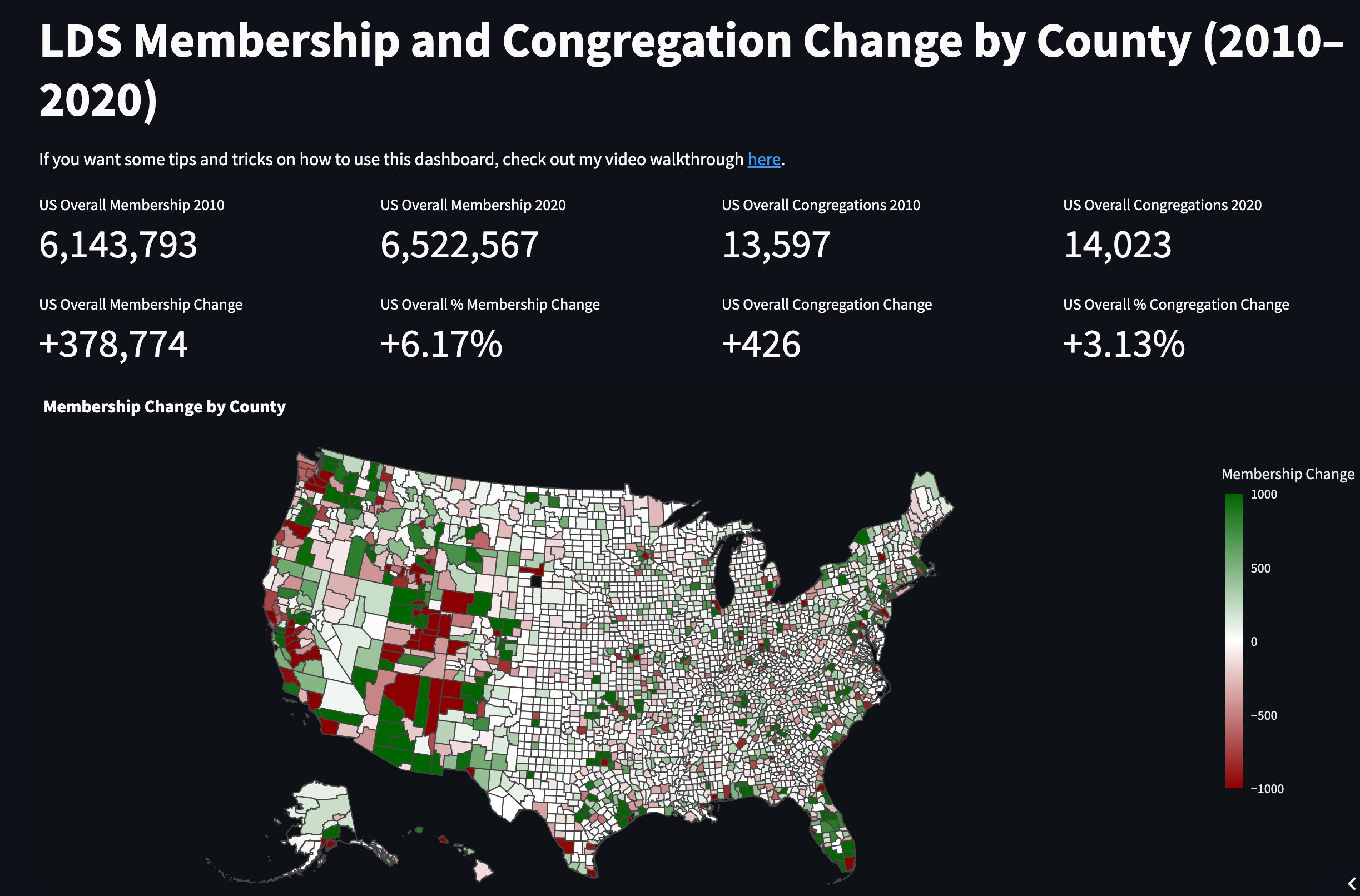
If you navigate to the church website, there are a few static charts, but it is generally unsatisfying. For the US, you have to click into pages to see different states and don’t get a sense of comparison across states or over time. Also, the data is only as small as the state level which leaves a lot to be desired.
My Dashboard…
I had gotten a fair amount of interest on understanding church growth on Instagram and here on Substack, so I decided to launch a fully interactive dashboard where you can experiment and play with the data at the county level! Look up your state and county and see how things are changing. Please note that the experience is much better on a desktop computer vs a mobile device.
👇👇👇👇
Here is the link 🔗
Also I created a youtube video walking you through how to use the dashboard and different features, so I’ll link that here if you want a walkthrough.
Features
I wanted this to be as useful as possible, and so I added several comparison points…
You can see how things change in overall membership nationally, statewide, and county by county.
There are stateviews where all of the numbers update to show state totals. Make sure to check out the toolbar on the side to update the state view and the variable you are looking at!
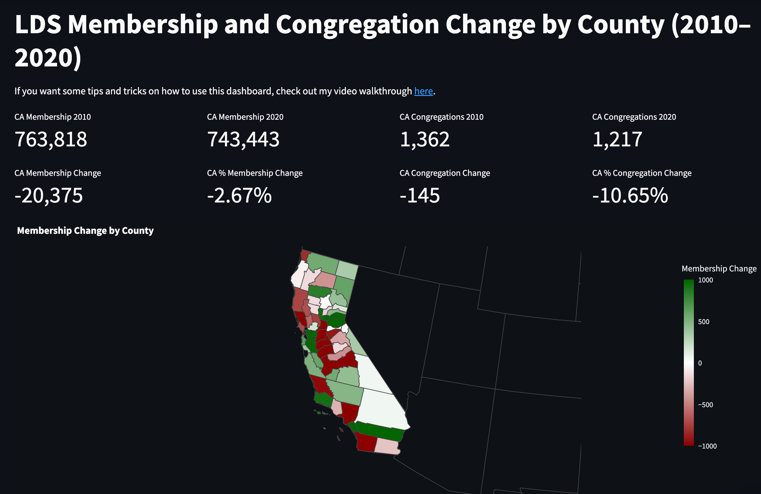
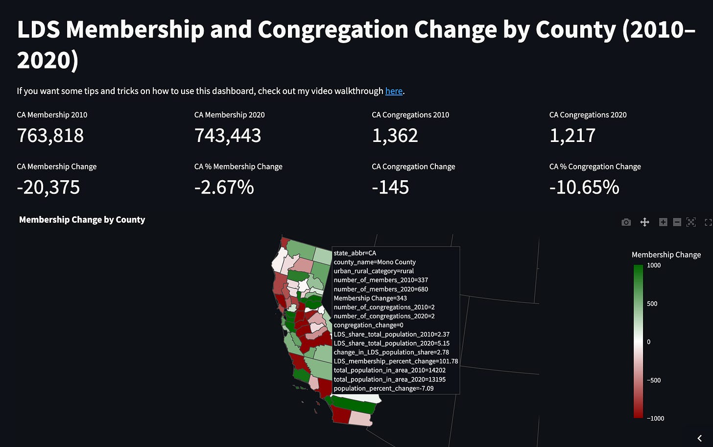
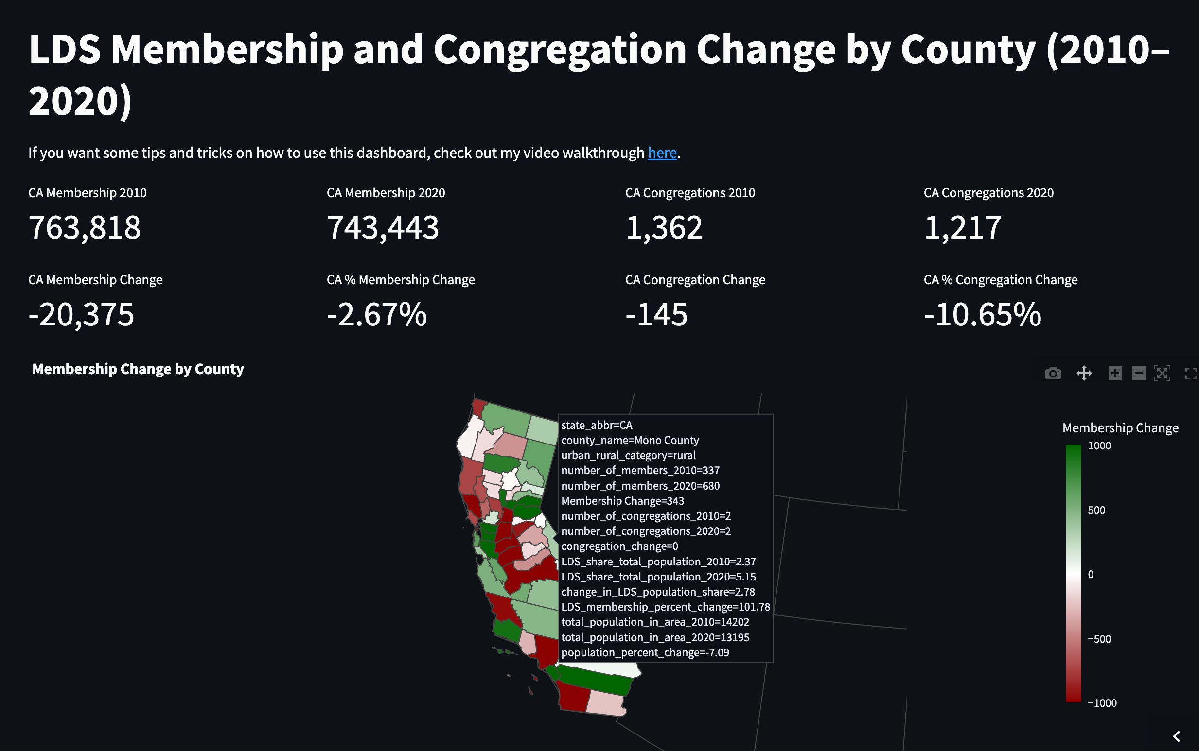
When you hover over a county, you get a lot of data. How did the number of members change? How did the number of congregations change? What do the percent changes look like?
I also wanted a ranking of different counties. So I included the top 10 and bottom 10 ranking either nationally or they update depending on the state selected.
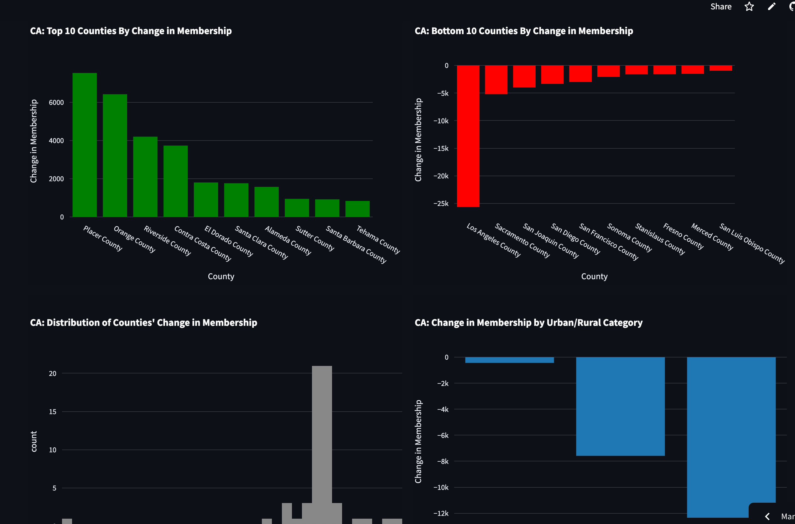
Another last feature I added was getting a sense of how urban vs. rural areas shifted. Are urban areas growing with the church or shrinking? What about rural areas?
The last detail I added was data about the state and county overall populations and the share of each population that is LDS. So you can answer questions like... well this county shrunk in size, but increased in membership. Or, this county performed well, but the county population increased a lot more than the membership.
Feedback
Let me know if tools like this are interesting and useful to you. This is definitely a trial, so if there is interest here and engagement I’ll make more tools like this in the future.
Anyways, back next week with a our normal data posts 🙂
Wow this is a beautiful tool! I could spend hours looking at these charts lol. It would be nice to see the share of Church members in 2010 and 2020, in addition to the change in share :) Thank you for your work on this!